- June 7, 2022
- Posted by: CoachShane
- Category: Trading Article

Not everybody has the ability to day trade and for most people, that may not even be the best use of their time. Day trading can be tough even when having a solid system such as our own High Velocity Wave Trader at your disposal. For me, I have the time but my personality doesn’t allow me to day trade and I’m sure many of you are in the same boat.
That doesn’t mean you can’t profit from the markets and I want to show you an approach that will allow you to do so.
What you will learn is how to determine areas of interest on a higher time frame chart. Once those areas are determined, you will use a lower time frame to find a potential setup. The use of alerts and stop orders will also assist you .
Using The Weekly Chart
The first part of our strategy is using the weekly line chart. Line charts plot the closing prices of the previous week and are useful to filter out the noise.

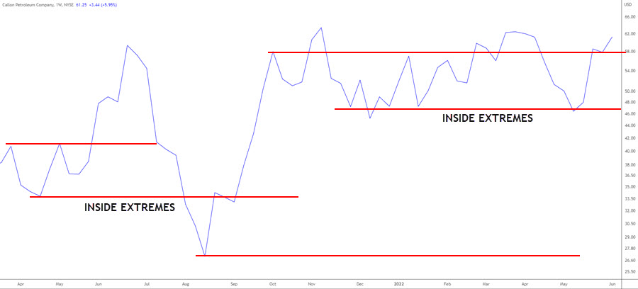
While you can use the extreme pivots on these charts, going inside the extremes is valuable. Often times when price returns to these zones, price will reverse prior to the extreme high or low. A good way to think about it is how the head and shoulders pattern sets up.

The head and shoulders chart pattern is considered a strong reversal pattern. You can see that price reverses at an area around the same zone as the left shoulder. A trader that always waits for the extremes to get tested will be missing out on some of the best trades that have huge potential for profits.
How To Use The Daily Chart
We’ve removed the noise by using a line chart as general view of potential trade areas. Our daily chart will use regular bar or candlesticks along with the 20 exponential moving average.

The 20 EMA is going to be used for general slope direction although price action will be more important since it is a lagging indicator. One important feature of the moving average is the ability to show you, objectively, when a market is not in a good condition for trading.
Nobody can dispute that price where the average is labeled, is in a trending condition that could be traded. In the middle of the chart, with price whipping across the average, you can see that it is not conducive to good trading. The weekly line chart may show you the zone, the daily chart plus the average will tell you whether you should skip the instrument.
Looking For Trades
The first thing you want to do is narrow down your focus list of instruments using any of the various screeners including Finviz or Tradingview. You want to find instruments that are trending and a quick method is a scan on the weekly chart with, as an example, the following settings:

You can adjust any of these scan settings as they are for example only:
Volume at least 500K over the last 60 days – We want to make sure we are looking at stocks that have interest
SMA 20 > SMA 50 – Making sure that the short term trend is up
SMA 200 < SMA 20 – Another confirmation of an uptrend
Last price >$5 – Not looking for penny stocks
SMA 50 > SMA 200 – Longer term uptrend
From that scan on the weekly charts, I got over 560 matches. I could sort them using one month percent change to get the ones that have made bigger moves which shows the stocks that were the most active.
Also note that you can trade against the trend when considering swing trading. While this is an advanced technique, understanding price movement and looking for one swing to profit from, is very viable.
Examine The Charts
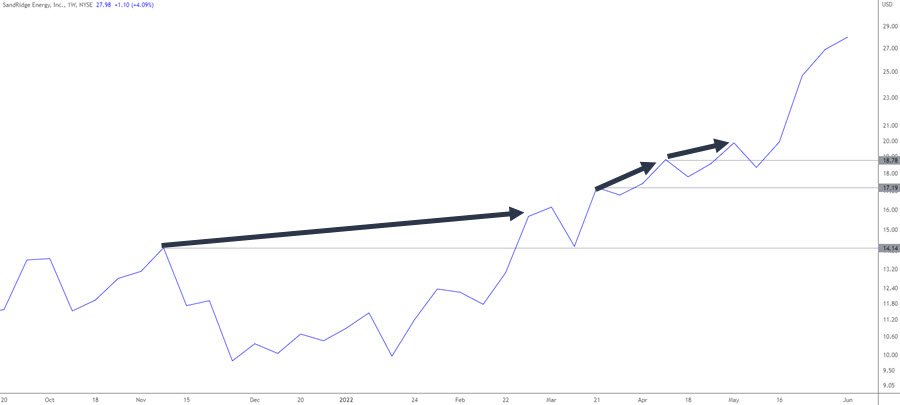
The first chart to look at is the weekly line chart. You are looking for a chart that has the line pivots that show the weekly closes have space. That means that you are looking for weeks that have been trending up (or down) from the past weeks. If you see many of the pivots close together, you already know the chart is choppy.

This line chart looks good and can see there has been trending action. As mentioned, I’ve drawn some lines inside the extreme highs and you are also free to use the extreme points.
Obviously using prior examples here to outline the strategy or I’d have to wait weeks using current action.
We then bring up our daily chart and see how price is shaping up near the zones. I can’t stress enough that you have the ability to read charts as there are certain things to look for if trading breakouts or pullbacks to increase the probability of success. These can be found by searching our website.
Also, if you came across this particular line chart today, you’d have no need to examine the daily because current price is far from any potential weekly support.
The Trading Strategy Setup
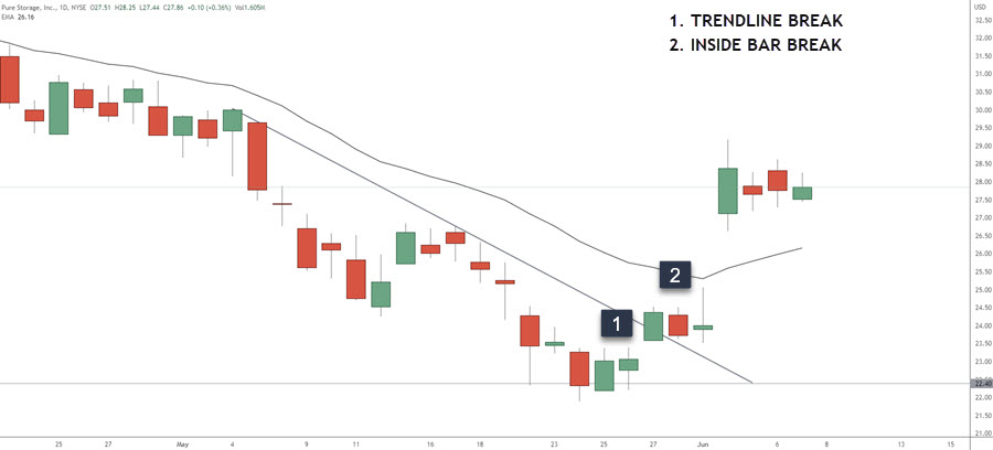
Using the first pivot from the left of this chart, this daily chart shows a breakout and pullback scenario. Price doesn’t stray far from the breakout point and this is a sign the breakout could fail back inside the range – which it somewhat does – but slight violations doesn’t always invalidate the potential trade.
 This chart looks to be clearing out weak longs with the gap down and the failure of further downside points to a probability of a move up.
There are a few different entry techniques:
+ You could trade the green candle at the bottom of the pullback
+ Enter on the break of the 20 EMA since the weekly chart is supporting the upside move
+ Look for two lows (or 3,4 – up to you) above the 20 EMA and use a buy stop above the second candlestick
+ Use an inside bar entry
+ Trend line breaks

Having a toolbox of entry techniques can be very helpful depending on price action.
One thing to watch for with the weekly chart is when there are quite a few pivots in the same zone. Remember, line charts show the closing prices so when you have many in the same zone over time, that zone becomes weaker, not stronger. Think of multiple hits on a support zone making that level weaker and eventually breaking.
Weekly Chart

The red lines define an area where price had closed multiple times. The black line represents virtually an untouched zone – or a resistance zone that was broken. I want you to look at the far right swing low and then look below on the daily chart.

This is a good example on how the moving average can also be used to show when price is extended. Price had pulled into an area of interest on the weekly chart, was extended from the moving average (think mean reversion potential), and a trend line break. Combined, we have the probabilities in our favor of a move to the upside.
Against The Trend
I mentioned earlier that you do not have to just trade in the direction of the trend. Many times, you can trade a swing against the main direction of price for a good gain especially when using weekly/monthly support/resistance zones. We will see that in this example of Bitcoin.

We see price decline with the first arrow and then rally only to put in another move lower at the third arrow.

On the left is the first visit back to the pivot zone where a trader could buy stop the high of that candlestick or swing high preceding it. In the middle of the chart is another visit to the zone with a large outside candlestick that closes bullish. A trader concerned about that candlestick could look for a break of the range for an entry long.
The black circle on the weekly chart is where we saw a resumption of the downtrend with a lower low being put in.
On the daily chart, the current area of potential resistance is below. Traders using this method would be looking for a rally into this zone.

Profit Targets and Stops
There are many ways to take your profits and the easiest is using a multiple of your risk.
To name a few profit ideas:
+ If you are risking $5.00 as an example, look for a gain of $5.00 plus commission/fees for a 1R target.
+ Trailing stops under/over the previous candle low/high, chandelier stop loss
+ Previous areas that can act as support or resistance
Placing a protective stop loss has just as many approaches:
+ Use the swing low or high that occurred before your entry
+ Using a multiple of the average true range is viable
+ Tuck your stop over or under any areas of a price consolidation
Simple approaches work and I urge you to avoid complicating this process. Just make sure you are not taking tiny profits and large losses. You will have a short career doing so.
Wrap Up
The high level overview of this strategy is playing support and resistance levels from higher time frames. We then use the daily chart to find our entry.
The moving average can be used to define a whipsaw in price, extreme moves in price, and for the conservative trader, use it for trend direction on the daily chart.
It is very simple to scan a line chart using weekly data to determine if an instrument is worth a deeper dive.

This chart has quite a few pivots and a handful of long lines where the long lines indicate trending action. If facing these charts on the weekly, look to the edges or the extremes and ignore the chop in the middle. That said, the daily chart may be a mess of long upper and lower shadows that won’t register on a close only line chart. Those are the charts to avoid.
Make sure to define your entry technique, your stop loss and take profit strategy, and stay consistent.
